Category Archives: Cover Design

Judging Books By Their Covers – Designing a YA Sci-Fi Book Cover

Hello, there!

They say “Never judge a book by its cover!” but let’s be honest…most of us do.  If I’m perusing in a book store and I see a cover that interests me, that’s when I pick it up.  Sometimes a title will catch my attention first, but most often, it’s the cover.

Over the past 8 years of publishing, I’ve had to learn a lot about cover design!  And not just the basics of it either, I’ve learned that every genre has its trends, and like all things in human culture, those trends evolve over time.

So with the intention of releasing Project Sirius book 1, a YA Sci-Fi novel, this year, it’s time to go back to the drawing board and figure out not just a good cover design for book 1, but something that I might be able to thematically keep up throughout at least the first few books, if not the entire series.

Popular Covers Today

So, where to start?  Well, I wanted to find out what some of the most popular YA Sci-Fi books were today!

…Turns out that’s not so easy.

I started with Amazon, heading over to their website, typing into the search, “YA Sci-Fi books” and then sorting the results by “Best Sellers.”

At the very top was “Editor’s Pick” for Red Rising, a novel I read last year that I quite enjoyed.  The cover is highly simplistic, an artist red wing on a black backdrop.  But this is a slightly older book, so I scrolled down.

What I found was…well, inconsistent.  Cover designs were all over the place and hardly matched one another.  That was when I realized that most of them were from very different publication dates.  That was when I realized that trends changed.

You might think, “Well then it doesn’t matter what you do, because whatever you do, that trend will eventually come back, right?”  Maybe…but you want your book to do well out the gate.

Also of note, later on I went back to Amazon and did the same thing, but my search terms were “YA Science Fiction Books” and…surprisingly, that completely changed the results.

Anywho, I started to google terms such as “YA Sci-Fi Book Cover Trends” and that, at least, helped bring me some interesting and potentially useable results.

For instance, this website discusses YA book cover trends in 2019.  And honestly, from what I’ve seen between 2019 and now, it was very accurate, if semi-generalized.  I recommend taking a quick look through to see for yourself, but it helped solidify an already vague idea in my head.  Specifically, the trend of illustrated artwork, which I’ve already used on my Urban Fantasy trilogy, Chronicles of the Sentinels.

Another website I found addressed all cover design trends expected in 2023.  More relevant to today, right?  Only, sadly, it doesn’t address YA Sci-Fi specifically.  The Young Adult it does talk about are decidedly not Sci-Fi.

So, in the end, I’m left with the original idea of illustration.

Relating To Project Sirius

So, with all of that in mind, I began formulating an idea, and started asking friends about their thoughts on my idea.  And I think we may have come to a conclusion, a direction I can give an artist.

Focusing solely on book 1 right now, I wanted to convey the protagonist’s journey from fantasy to ‘reality.’  Since I’m not hiding the fact that this is a sci-fi story at its heart, making a purely fantasy-type cover wouldn’t do.  But Mika’s origins in a fantasy world shouldn’t be ignored.

A cover that uses framing as part of the design

Then it occurred to me – framing.  Mika’s life in a fantasy world is literally surrounded by a sci-fi ship.  And there’s this one iconic moment in the story in which she gets her first real glimpse into reality.

Thanks to some thoughts and opinions from my wife and friends, I came to the final solution.  Mika will be centered in the artwork, as is normal in YA cover art, wearing her medieval-style winter gear and cloak, wielding a bow and arrow, looking towards the reader.  She’s standing in a winter landscape with snow, trees, and ice.  Surrounding or framing this image is the hole in the outer wall of the dome, leading into the corridors of the ship, so the frame of the artwork would be damaged ship panels and conduits.

There’s a lot of ways this could be illustrated, but I think in this case, realistic or semi-realistic illustration depicting this would work best for the genre, based on recent and current cover art trends.

So, where does that leave me?

The latest beta readers have not yet completed their read-throughs, but I’m moving forward to producing the publication package, starting with the cover art.  So it’s time to take the idea for cover art and actually get the art made.

Which means I’ll be reaching out to a cover artist soon :)

I’ll also need to do one last proofread/edit of the manuscript before converting it to the publication format.

As for speculating a release date?  I’m not sure yet on that one.  It might largely depend on how long it takes to get the artwork completed.

But unless something goes terribly wrong, you can definitely expect Project Sirius book 1 to be out this year :)

Thanks for reading!
-Jon Wasik

Advent Darkness Cover Reveal and Kindle Pre-Order

Hi everyone, I have exciting news today!  The cover reveal for the next Sword of Dragons book, Advent Darkness, is happening….right here, right now!

So without further ado, I give you:

Artwork by Fotokostic

You can click the image to see a larger version of it :)  And while we’re here, why not show off the full sleeve with the back blurb and all?

Artwork by Fotokostic

Release Date and Pre-Orders

I’m so excited and proud to show you all this new cover, and to announce the release date is set for Saturday December 3rd, 2022!

Even better, as of today, the Kindle version is available for pre-order!  I’m still waiting for all of the processes to finish for the print edition to be available for pre-order, but that is planned to be ready this week, hopefully in the next 24 to 48 hours!

Click here to pre-order your Kindle edition today!  Advent Darkness will also be available on Kindle Unlimited for those who subscribe.

Check back here and on my Facebook page to find out when the Print edition is ready for pre-orders!

Let me know what you all think of the new cover :)

Thanks for reading!
-Jon Wasik

Adventures in Self-Publishing – Chronicles of the Sentinels

If anyone ever tells you “It’s so easy to publish a book these days!” They’re lying.

But if they tell you “It’s worth it,” that bit is true!

I mean, sure, you can just slap a text cover on it, submit it to KDP for Kindle only (maaaaybe print if you want,) and call it good.  That’s easy, true.  But chances are, you aren’t going to sell a lot of copies.  You aren’t going to reach your audience.  Especially in this market.

But if you want to make a quality product?  Something that catches the eye and draws in your audience?  That’s hard.

The most frustrating part is that it’s never the same experience twice.  Something always changes.  New challenges arise.  “Opportunities” some folks might call them.

Here’s the (somewhat abbreviated, but somewhat technical) tale of the adventures in preparing Chronicles of the Sentinels – Legacy for self-publishing.

Beyond the Cover Art

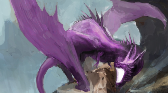
I previously wrote about my adventures in commissioning cover art, and the success I had in that adventure.  The question I had after that was – do I help fund this book with a Kickstarter campaign?

The answer ended up being “No,” mostly because I was already running low on spoons, so to speak.  I was already a bit overwhelmed…and boy, did that end up being the right answer.  Because very little went right after that.  Every inch forward felt like a mile, and so many things went wrong.

Creating the print cover was step one, and I’d never created one for art that wasn’t a full wraparound.  I looked to the copious urban fantasy book examples my wife and I have at home, and I’m quite happy with the results!  But the first challenge I ran into with that?  Paint Shop Pro 2019 doesn’t play well with 4k resolution desktop settings on Windows 10, and all of my interfaces were impossible to use or read.  So anytime I opened up PSP to work on the cover, I had to change my resolution back to 1080p, reboot (because PSP would still be messed up if I didn’t) and work, then change the resolution back to 4k and reboot if I wanted to do anything else.

As tweaks became necessary down the road, this has become an exercise in patience.  “But why not just switch to Photoshop?”  Adobe is ridiculously expensive, and I hate their subscription model (I also despise Office 365 for the same reason.)

Enabling Print Pre-Orders

The next challenge came from a strong desire to allow print pre-orders.  Amazon KDP doesn’t have any method to allow this, they only have it setup for Kindle.  The best answer I found was IngramSpark, which I’ve never used before.  So there being a challenge was inevitable, but little did I know that it would all come back to the cover again.

To give a bit of background, for all print on demand services I’ve used, they require your cover to be in .PDF format when you upload.  eBook services will allow other formats, just as JPG, TIFF, or PNG, but not for the physical print edition.  That meant converting my PSP-created file into PDF.

In the past, I used a free online converter to do so, that worked well.  I’d tried multiple of them, and all of the free ones, except this one, changed the dimensions of the cover.

So my first attempts at the cover upload on all of the venues was successful.  I started with the Amazon POD and ordered a proof copy.  When that came in, I saw some issues that needed correcting.  This was also about the time that IngramSpark, who take several days to review and approve covers, came back and said the dimensions on my cover didn’t match what they needed.  The resolution they gave me in the rejection email was NOT the same that their guide gave me for the size of my book.

I tweaked the cover, created a version that was the appropriate size for Ingram, and used that online free converter.  I uploaded to Ingram first, hit ‘submit for review,’ and then went to KDP and uploaded.

And the cover was oversized.  I blinked in surprise.  Went and looked at the PDF.  The converter had doubled the size/resolution of the final file.  Just four days before, it hadn’t.  But now it did.  And every time I’ve tried to use that converter since, it does the same thing.

I’ve used this converter since 2018 without issue, and now, all of a sudden, it starts doing this…  So that meant only one thing.

The Search for a Good PDF Converter

I had to go looking for a converter again.  But every single free one out there (other than Adobe) changed the resolution, or added a border, or did who knows what else.  I also had once, long ago, subscribed to Adobe Acrobat Pro to see how it did with converting.  It compressed it sooooo much that it was blurry as hell.

Same with their online converter, which I tried this time.  It took what was normally a 20MB file down to 600KB or so.  Still, running out of options, I decided to try it with a proof copy.  When the proof arrived, the drop in quality was completely unacceptable, and their converter doesn’t allow any tweaking of the compression.

Frustrated, I thought, “Why TF can’t I use Paintshop Pro?  Is there an add-on I can buy for it to directly convert the source files to PDF?”  The answer is no, but the company that owns PSP, Corel, had a dedicated conversion software, PDF Fusion.

I paid the money for it, hoping it was a good long-term investment.  It was…frustrating at first.  It’s interface is not intuitive.  But eventually, I was able to disable all compression.

But the challenges (aka frustrations) didn’t stop there.  The conversion of the KDP cover was fine.  But the IngramSpark cover?  See, Ingram uses a slightly thinner paper, which means the spine is thinner.  So I had to shrink the overall cover by a small amount.  So I’d shrink the canvas size on the original cover source, save it to PNG, and convert it to PDF using Fusion……..and suddenly there’s a white border on both sides.

And it wouldn’t.  Stop.  Doing that.

My wife had an idea to see if her free art software, GIMP, could convert to PDF.  It did, but the same exact issue happened – a white border once converted to PDF.  It made no freaking sense, and nothing online could explain it.

Finally, Beck decided to try to take the source image itself and shrink it in GIMP directly, in case PSP was causing issues…and that’s when she brought up a need to change both the canvas size and image size.  This confused me – I never needed to do that in the past when changing canvas size – changing canvas size usually changes the image size, too.

Apparently, not so.  And PSP was retaining data for the image outside of the modified canvas size.

What I ended up doing was opening the source image, then creating a NEW image file with the IngramSpark dimensions, and copy/pasting the source image into it.  The parts of it that were bigger than the Ingram dimensions ‘went away.’  And then I converted to PDF, and no white line.

Whew.  Freaking finally.

The cover worked out after that.  Proof copies from KDP looked good, and as of this weekend, copies from Ingram look amazing!  The worst was over.

Or was it?

Building a New Author Website

The next challenge came with building a new author’s website.  By the time I’d decided to do so, I was deep in the middle of frustrations with the cover and PDF conversion, and my energy was running low.  So I thought I’d go with the proven web provider, GoDaddy.com.  That’s where http://www.theswordofdragons.com/ was built, and I liked their builder interface.

So I went onto my account, created a new domain, and paid for a year in advance.

And…the builder wasn’t a builder.  I input my name, site purpose, and some other stuff, and it ‘auto built’ my website.  And didn’t allow me to customize anything in layout, shape, etc.  I could choose pre-built themes, but that was it.  It was known as the ‘block editor.’

I was frustrated.  And I ended up spending hours on support chat over it.  The guy I was chatting with insisted it was the same builder as the one I was used to.  I told him “no, it’s completely different, I can’t custom-build my site!”  Finally, we got down to it, and I told him “Just convert my account on the new site to the same builder as the old site!”  “I can’t do that, we no longer have that builder.  Only block editors are available now.”  “Then I want a refund!  I mean, for crying out loud, WordPress has a better editor than your new editor!”

That apparently sparked an idea in the guy, and he said, “Oh, we can convert your site to wordpress!”  Well, since this very blog is hosted by wordpress, I was like “Alright, I can at least somewhat custom build a site in WordPress.”  So he converted it, refunded my old account, and got me on a new subscription.

Except…it wasn’t the same.  The wordpress editor through GoDaddy is not at all the same as this one’s, and further frustrations ensued, but at least it was better than the old one.

Hence, jonwasik.com was finally born.  It’s not perfect, there’s gaps I can’t get rid of on the site because their editing interface sucks, but…I don’t have any more energy or patience to spend on it.

The Finish Line Is In Sight!

So, pre-orders are available.  Jonwasik.com is online.  The release date is set.  In less than a month, Chronicles of the Sentinels kicks off with book 1.  I have 20 author copies in hand already for the release party, and planning to order more today.

The frustration is over, right?

*sigh*  Nope.  One last frustration.

I created an event on Facebook for the release party.  I’ve hosted countless parties through Facebook events over the years.  But this time – people weren’t seeing the invites I sent them.  And some who did, tried to mark themselves as going, and it wouldn’t let them.  And they’ve changed how it works, how to create an event – there’s apparently no way to set a co-host anymore.

But at least that so far has been the end of the frustrations.

Hopefully book 2 won’t be nearly as frustrating.  And this effort has been worth it, because in just 4 short weeks, Legacy launches, and I am so proud of what I’ve produced and can’t wait to share it with all of you!

Thanks for reading – if you made it this far, you’re a dedicated reader :D

-Jon Wasik

The Great Reveal: Chronicles of the Sentinels – Legacy!

Hi everyone,

Today’s the day!  And what a journey it has been to get here…but as of a couple of hours ago, across my social media presence, I revealed the full cover for Chronicles of the Sentinels – Legacy!

And I would be remiss not to present it here, so here ya go! :D

I was so afraid when I commissioned this artwork, because Sentinels has been a passion project of mine for so many years, and I wanted it done right.  I’d seen some negative reviews for Fiverr and was worried about that.  And yet, the artist I worked with, and the artwork he created, was absolutely fantastic, and compared to so many other things I’ve had trouble with in the past month, it was such a smooth and collaborative project!

In fact, if you’ve a few minutes and are interested, click here to see Shupeipa’s Fiverr profile!  (No, he didn’t ask me or pay me to do that, I’m just so in love with his artwork that I wanted you all to see more of it!)

In fact, compared to preparing everything for KDP and Ingramspark, it was probably the ONLY thing that went smoothly in this whole process O_o  But that’s a story for another blog in the near future.

In any case, for those curious about the print edition, here’s the full cover wrap :D  (Click the image to see the larger version.)

Creating the print cover was an interesting exercise.  At first, when I commissioned the artist, I wanted his artwork to fully wrap around.  Except…the lesson I learned from the Sword of Dragons series was ‘don’t re-invent the cover.’  Urban fantasy books very, very rarely (based on about 40 urban fantasy books that my wife and I own) have full wrap cover art.  Usually it’s just the front art, and then something stylized for the rest of it.

So far I’ve only got blemished (thanks, KDP, for your interfering banner on proof copies) physical copies, but when I have a clean copy to show off, I’ll be sure to get a photo to show you all :D

Release Date and Pre-order!

What would a cover reveal be without the announcement of a release date and pre-order?!  Well, it’d be exciting still, but I digress ;)  I’m excited to share with you the final release date for CotS – Legacy:

August 7th, 2021

That’s right, in just over a month, book 1 will be yours for the taking!  What’s more, if you want to get in on the ground floor, book 1 is already available for pre-order on Kindle!

Click here to pre-order your Kindle edition today!

I’m trying to get something to work for pre-orders on the print edition, but Ingramspark has been fighting me…more to come on that, but stay tuned!  :D

Thanks for reading, and I’ll see you again soon!  :D
-Jon Wasik

The Sword of Dragons – 2nd Edition Cover Reveal!

Hi everyone, today is gonna be one jam-packed blog!  It’s been over a year in the making, but the 2nd editions of the first two novels in the Sword of Dragons series, along with the print edition of the Orc War Campaigns anthology, finally have a release date!  This also means that I finally show off the covers!

If you’re new to my blog, a long time ago I announced that I was working towards this goal.  One of the many changes in the 2nd edition was a unique title for the first book, previously just titled “The Sword of Dragons.”  Now it is known as “Rise of the Forgotten”!

So without further ado, I give you book 1’s new cover!  (Click image for larger version)

Rise of the Forgotten full cover! Artwork by Vuk Kostic

But wait, there’s more!  As I said, this is a triple-book release event!  So I now give you the cover art for Burning Skies:

Burning Skies Full Cover. Artwork by Vuk Kostic

And finally, the one cover I’ve given no hints or previews to whatsoever over the past year, the cover for The Orc War Campaigns:

The Orc War Campaigns Full Cover! Artwork by Vuk Kostic.

One of the things I’m hoping you’ll notice right off the bat is that the artwork is a similar style across all three.  In my search for cover art, I was fortunate enough to find an artist on Shutterstock named Vuk Kostic whose artwork was exactly what I was looking for, and he has posted copious amounts of artwork with dragons!  So it gives me a large pool to choose from :)

I am very happy to have spent the money to purchase the rights to utilize his artwork, and at least for the time being, I plan to utilize his artwork for all future Sword of Dragons covers.  I highly recommend checking out his Shutterstock page to see what else he has, he’s a fantastic artist!

There’s been far more done to the books than just shiny (actually matte) new covers!  I have proofread all three books several times over the past year and found numerous items to change, some of which I noted in my previous blog.  The pacing and flowing should be a lot better, and this will make them even more enjoyable to read :)

Not to mention maps!  There are maps inside the books!!!

Release Date Announced

Even better news, I’ve officially settled on a release date for all three books…and it’s just around the corner!  Drum roll, please….

November 16th, 2018

Yup, you read that correctly, this coming Friday!

Image Source – http://survivor-org.wikia.com/wiki/File:1723893-875275-firework-streaks-in-night-sky-celebration-background.jpg

In fact, as soon as Amazon approves everything, the Kindle editions will be available for pre-order!  I’ll update my facebook author’s page as soon as I get notification with links to where you can go to pre-order!

Unfortunately KDP has no method for allowing pre-orders of the print editions, but fear not!  As soon as I possibly can, this Friday I will post links to them once they are available!

Thank You Followers and Fans

I want to thank all of you, my readers, my fans, everyone.  This has been a tremendous effort that has been on top of considerable life changes.  Since I began this undertaking, I lost my Mom, married my wonderful Starshine, and moved.  Through it all, I’ve received nothing but encouragement and support from everyone.

It means the world to me.  I hope you all feel like this was worth it, and I hope you enjoy.  I look forward to hearing what everyone has to say about them!!

Thank you for reading :)
-Jon Wasik

When Is It Time For A Cover Reveal?

Hi everyone!

I found myself struggling to come up with a blog article today, so the first thing I thought was, “Maybe it’s time to do a cover reveal for one of the new books!”

…but is it too soon to do that?

I honestly wasn’t sure what might be appropriate from a marketing point of view, so I decided to hit the search engines and start reading articles.  And pretty much immediately, the consensus was clear: not until your book is ready for pre-orders.

Do you agree?

Rise of the Forgotten

I’ve already done a partial reveal with the text on the titles, and I’ve received proof copies of Rise of the Forgotten and Burning Skies, both of which revealed a couple minor tweaks that are needed (and already fixed on the digital files.)  But should I wait for a complete reveal?

I think it makes sense to an extent.  That first impression can come with a buy impulse for a reader.  “That looks cool, I wanna buy that!”  So pre-orders would hopefully mount up.  Where as if I revealed the cover now, but pre-orders weren’t ready for another 4 or 5 months, people’s initial excitement might be long lost and pre-orders might be less than stellar.

So for the moment, I’m going to hold off on the cover reveal.

I want this release to be done right.  I want to learn from the mistakes I made in the past.  And I want to give my readers the best experience that I can.

What I can say is that I’m still strongly thinking about a pre-order bundle somehow that will include all 3 books (Rise of the Forgotten, Burning Skies, and The Orc War Campaigns) as well as a printed map, either of Edilas or of all of Halarite.

I’ve recently done just a test print on an 8.5×11 paper with an aged parchment effect, and I like it!  If a print service can do this larger, and on the right kind of paper, this would definitely make for a neat extra to throw in with pre-orders!

The only challenge I’m running into right now is a platform to sell the bundle through.  Etsy is a no-go because they only allow the sale of hand-crafted items, not printed books.  So I need to find a venue appropriate to such a sale, and eBay doesn’t strike me as appropriate.  Does anyone out there have any suggestions?

Thank You For Your Patience

Before I sign off, I wanted to say thank you to everyone who gave me words of support last month after my Mother passed away.  You words warmed my heart.  :)  I went nearly a month without a new blog, but I’ve still been seeing visits, comments, and likes on past blogs, and I’m grateful to everyone.

See you all next week!

-Jon Wasik

The Big Announcement – My Next Publication!

Hi everyone!

I’m excited to write this blog post today, because I’ve been hinting around my new writing project for some time, but I’ve not actually made any official announcements.

As many of you know, my life has been extremely crazy and busy lately, between moving, wedding plans, and work going through a busy period, so I knew I was not going to get the 3rd book of Sword of Dragons finished in time for its planned release.

In fact, I’ve not had a chance to really focus on writing the 3rd book at all, I don’t have the time to devote to it.  But with all of my conversations with my fiancee about book covers, and all of the research I’ve done online, I knew there was a project I could do that would allow for very short spurts of work on it between the busy times.

The Sword of Dragons novels have all received high praise from those who have read it, but getting people to give it a chance has been a difficult task.  All of my market research and discussions with other authors and my fiancee point to several factors, including but not limited to the cover.

As such, I am officially working on the 2nd edition of books 1 and 2 of the Sword of Dragons series!

What does a 2nd edition mean?  More than just a new cover.  A whole lot more!  But let’s start there.

The New Covers

Books 1 and 2 side by side :)

As I talked about in my last blog, I’ve learned that keeping marketing in mine from the get go has been important.  This was a key focus for when I started working on new covers for books 1 and 2 while also planning covers for book 3 and for The Orc War Campaigns.  I wanted to create a theme that could be carried through all 4 books, as well as be something I could carry into the rest of the series beyond book 3.

My focus on marketing this time around actually was a big help in coming up with the final cover layout for the entire series!  I also followed the advice of publishers, editors, and cover artists, and created multiple versions for each novels’ cover, and then worked with several people to decide which one worked best, and even how to make the chosen one for each book better.

This involved sending the version to everyone helping me, as well as following my fiancee’s advice and taking a screenshot of an Amazon page, and editing in the versions of my cover to see which stood out best, and how my improvements to them changed how it popped on Amazon.

The result?  4 very amazing covers!  That I can’t reveal just yet.

Cover by Christian Michael

*ducks*  Hey don’t throw things at me!  ;)  But seriously, I am not yet ready to reveal the covers.  What I can tell you is test prints have turned out amazing, and even Christian, the man who made the cover for book 1, agrees that the new cover scheme is well done and works well with my genre.

Where did I get the cover art?  That was where a ton of my time was spent: looking for cover art.  And I ended up finding a cover artist on some stock photo websites who has done several pieces of dragon artwork that is stylistically similar.  This allowed me to find 4 pieces of cover art that are stylistically similar, and I have knowledge that there is plenty more for me to use for future books.

The best part is, being stock art, I can buy the rights to use them on the novel.  No legal issues, no ‘I hope they don’t realize I used their art without permission.’  I’ll have followed all proper procedures and will have legally procured the rights.

However, before I did purchase the rights, I took the watermarked, low-res versions of the artwork and made test covers, then printed them out to ensure they would look good.  This is a method I intend to use from here on out, to ensure that I don’t spend money on cover art that I end up never using.  I am, after all, working on a very limited budget.

Maps Will Finally Be Included!

I’ve heard it from countless readers: maps are a must!  So the 2nd edition of books 1 and 2, and all future volumes of Sword of Dragons will include maps.  I’ve had physical copies for a while, but haven’t had a chance to get them scanned, and a visit a couple months ago to Office Depot to get them scanned was highly disappointing, resulting in totally useless files.

Thanks to Wayne Adams from VtW Productions, I was able to get high-res scans finished last weekend.  This means I now have digital copies to edit and prepare.  These will first be made available on the website, http://www.theswordofdragons.com/, but will also be included in the novels.  I hope this will be a big help to everyone who reads the novels!

Much-needed Editing

Photo by Wayne Adams of Death’s House Productions

My original plan with the 2nd editions was to do another set of proofreads to catch any spelling or grammar issues.  As I started on book 1, it became very clear that my first published novel was in need of some serious TLC beyond copy-edit.

I am not changing the story, but I am fixing up how the story is told.  Sometimes this means very few changes, but sometimes this means entire paragraphs are rewritten.

My beta readers have read through the rewrite of chapter 1 and thoroughly enjoy the changes, while noting that even though they have read the original version several times, the changes weren’t distracting.  In fact, this is what I am working on right now, and am about 1/3rd through book 1.

Furthermore, Wayne and 2 of his friends have volunteered to perform copyediting on books 1 and 2!  So this will further ensure a polished edition :)

But…book 1.  Hmm.  The Sword of Dragons book 1.  Naw, that needs a better title.

Naming Book 1

When I first prepared book 1 for publication, Christian insisted that I should give book 1 its own unique title, different from the series title.  I didn’t listen.  And now I regret that decision.

So that will be part of the change in the 2nd edition.  Book 1 officially has its own title!  *drum roll*

Rise of the Forgotten

Rise of the Forgotten

It fits quite well, not just in a big way, but in many small ways :)  Plus, giving book 1 a unique title has allowed me to keep a theme for the covers of all novels.  (And yes, I just showed you a sneak-peak of book 1’s cover ;) )

Those are all of the big changes coming in the 2nd edition!  “What about book 3” you might ask?  Well, that already has a title and a cover!  But I still need to finish the actual manuscript.  The Orc War Campaigns also has a cover, but again, I need to finish edits on it before it is ready for release.

“When will these be released?”  I do not yet have a timeline for that, and I’m hesitant to try to set one at the moment.  There’s still too much going on in my life to be able to predictably work on the edits.  But I am working as diligently as possible, and I am looking forward to revealing more as time goes on!

I hope with these 2nd editions to please the fans I already have with a nice, polished, worthwhile product, while also attracting new readers!

Thanks for reading! :)
-Jon Wasik

Planning Ahead for Marketing

Hi everyone!

When it comes to self publishing, one of the things I’ve struggled with the most is marketing.  In fact, it’s been one of my biggest banes since I started down this rabbit hole.  Going in, I had no idea just how important it was, and for that matter, just how much it needs to be a part of your product development from day one.

I thought I had it all figured out in the beginning.  The day that I decided that I was going to self publish The Sword of Dragons, I immediately started looking at what I was going to do for a cover design.

Image Source – http://indiefreshpress.blogspot.com/2016/08/store-tour-absolutely-fiction.html

This led me to wandering bookstores with friends, pointing out book covers that stood out to us, discussing the good and bad parts of covers, and trying to figure out what would make a good cover for the Sword of Dragons.

In hindsight, doing so, especially first thing in the planning process, was a smart idea.  Unfortunately, that was probably one of the few things I did right in the beginning.

What did I do wrong after that?  For starters, I didn’t have a fully finished product.  I wanted my book out there, and I didn’t want to wait to finish important things, such as getting a polished world map ready.  I also didn’t spend more time researching marketing, researching fantasy novels, or cover design.

At one point, while looking at covers, I looked to a couple of my friends and said, “all of these fantasy novels look the same.  I want mine to stand out and be different.  So I’m not going to follow their examples.”

In principle it sounded like a good idea.  Make my book stand out amongst all the others.

Except I was looking on bookshelves.  Not at Amazon.com.  Not at Barnesandnobel.com.  Plus there’s one other aspect I hadn’t considered…

Don’t Reinvent the Wheel

I’ve run into a problem with the Sword of Dragons series: everyone who has read it has thoroughly enjoyed it, and I’ve even gained a few fans!  And they’ve done their best to try to spread the word to others.

Books 1 and 2 side by side :)

But what about those who don’t know me or don’t know any of those fans?  Or even know the fans, but are so stretched for free time that they are picky about what they read?  What do they think when they see the cover for the Sword of Dragons or Burning Skies?  Do they see a book that looks like a great fantasy adventure?  Or do my covers say something else to them?

I’ve touched on the subject before about cover design, you have to target your audience.  And one of the things you can do is make a cover that fits within your genre while standing well on its own.  Many, many people have told me at this point, “put a dragon on your cover, your sales will increase.”  Why?  Because my book has dragons in it, and the entire series will increasingly feature dragons.  So I want to attract readers interested in dragons.

But there’s more to it than that, and this has as much to do with marketing as graphic design.

Marketing Books in the 21st Century

I think one of my biggest mistakes was trying to consider how my book would look on book shelves.  Even if I get to that point some day where Barnes and Noble puts my novels on their shelves, before I can get to that, I need to consider how my covers will look as a tiny little thumbnail on amazon.com.

And while working on a project’s cover recently (well, sort of recently, before we started packing to move), my fiancee had a great idea that I believe may have helped me in the long run.

If you go to amazon.com and start drilling down into book categories to, in this case, fantasy novels (sword and sorcery!) take a look at the books there.  The covers have all been resized down to thumbnail size.  Beck had the idea, “take a screen shot, and then edit in your cover design to see how it looks in comparison with the others.”

I knew the moment she said it that it was an amazing idea, and set out to do so.  It also helped me figure out which cover to use, because I had ideas for 2 or 3 different covers and had made preliminary versions for each.  I put each version up as thumbnails, and very quickly identified which cover popped best while still being easy to identify as a sword and sorcery type novel with dragons.

But I also realized there were issues with the.  The title blended in with the cover, and the cover was too bland-colored.  So I made modifications and performed several tests, until I had a cover that popped out nicely and whose title was easy to read.

That’s the thing to remember: whether browsing amazon.com or viewing your book cover from a distance at a bookstore, a reader will more likely see your cover as a thumbnail size, and so your title needs to be easy to read without overtaking your entire cover.  A difficult balance to strike, but well worth the effort.

Why Is The Cover So Important?

I keep coming back to this topic: your cover matters a lot.  Why?  Because every single aspect of your marketing campaign is going to hinge on your cover.  In book stores and on amazon.com, it’ll be the first thing a prospective buyer will see.  In a convention or book signing event, it’ll be the first thing patrons will see.  On advertisements, anywhere, whether amazon, facebook, or other, it’ll be the first thing they see.  If you have the money and resources to pay for adverts on billboards, bus sides, or trains, again, your cover, or some edited version of your cover, will be what people see first.

First impressions matter.  People judge books by their covers.

Granted, if you have a fantastic cover but a crappy story, you aren’t going to get anywhere with sales, either.  You might do better than if you had a bad story and a bad cover, but reputation will probably kill your book’s sales.

Do you have a good story?  Then you need an appropriate cover to go with it.  Not just good, but appropriate.

There’s more nuances you can add into a cover design, but I think I’ve written enough on the topic for one day :)  I hope this helps my fellow authors out there, I’ve learned so much about marketing and cover design in the past 3 years and I wish to pass that knowledge on!

Do you have any tips or lessons learned about marketing and cover design?  Please post them in the comments below for others to read!

Thanks for reading,
-Jon Wasik

An Unfortunate Delay – Regrouping

vegasHi everyone!

I’m back from Las Vegas!  Yes, that’s where I went for my short vacation :)  I’m not exactly a Vegas kind of person, but it was neat to see the strip and Lake Las Vegas.  My Fiancee and I shared a Yard Long while we were on the strip, that was definitely fun :D

But now, on to the title for today’s blog…

Delaying Book 3

This is perhaps the hardest announcement I’ve had to make: there is just no way I can get book 3 of the Sword of Dragons series out by May.  In fact…I really have no way of predicting when I will be able to get it out.

Image source - google.com
Image source – google.com

I’ve known about this for a little while now, but have been trying to figure out how to tell you all.  I am really saddened by this announcement, and I cannot begin to convey how sorry I am.

The reason for the delay?  I am only 4 chapters into writing the first draft, and have not been able to make any progress since the end of December.  Things have been really busy, and I am due for a certification at work that I need to focus on or risk losing my job.  Simultaneously, I have been looking for a new job, due to the insane, non-stop stress of my current job (and that really is an understatement…)

This is where I really wish I could just write full-time.  I have so many ideas, and just no time at all to work on any of them right now.  The Sword of Dragons, Chronicles of the Sentinels, and the slew of other series ideas I have.  I am so incredibly sad that I cannot work on writing more right now :(

An Idea for the Future of Sword of Dragons

Cover by Christian Michael

As I posted in a previous post, I’ve been considering creating new covers and rebranding the Sword of Dragons, including giving a more unique title to the first book.

One of my friends commented on my facebook that this might not be necessary, and that I should instead focus on advertising book 1.  To that end, I’m going to begin promoting it once again and promoting Burning Skies a bit less.

However, I do think that I can present a stronger product with some additional work.

Image Source - http://geistig.deviantart.com/
Image Source – http://geistig.deviantart.com/

So my first plan?  Try creating a cover that is a similar style to what I would do with books 1 and 2 for the print run of The Orc War Campaigns.  I know that this is a bit of a risk, because it will mean spending money on buying the rights for an image for the cover.  But it will help me determine if I can do the kind of presentation that I want, both for the cover, and inside.

If things go well with the Orc War Campaigns, and it gets a good reception, I’ll rebrand the first two books, and publish their 2nd editions a month apart as a run-up to the release of book 3.

When will all of this happen?  …I don’t know yet.  And I know, it’s not good marketing to state that publicly.  But at least for the next few months, I won’t be able to direct much time and attention to my own novels.

I hope you all understand.  This is the hardest decision I’ve ever had to make in my writing career, but it is necessary.  I really am so sorry for the delay, but I hope you all feel it will be worth it.

Thank you for reading :)
-Jon Wasik

What Does Your Cover Say?

They say a picture is worth a thousand words.  And if there’s one thing I’ve learned in the past couple years, the cover of your novel can make or break you.

Recently my fiancee found an article that we read together today, found here, and it made me think of a lot of things, and I think even helped me answer one very important question: why have sales for Burning Skies been so much worse than The Sword of Dragons?

It boggled my mind, because almost everyone who has read Burning Skies told me they loved it as much if not more than The Sword of Dragons.  So it wasn’t that it was poorly written or a bad story.  And my advertising campaigns for Burning Skies have all tanked.  Fewer clicks than my ads for book 1, and no purchases.

Your Cover Describes Your Book

I’ve said this in a previous blog, long ago, but what’s the first thing a person sees when perusing either a book shelf or an online book store?  The cover.  “But don’t judge a book by its cover!”  So the expression goes, but frankly, everyone does.

David Penny's original covers...Thriller or Historical Mystery?
David Penny’s original covers…Thriller or Historical Mystery?

So what does your cover tell potential buyers?  What does it tell people your book is about?  The one time I went to a writer’s convention, one of the panels I went to covered this very idea, and again in the article I mentioned earlier.  An example writer, David Penny, had a well-crafted cover for his historical mystery series, but what he was shocked to realize one day was that his cover made readers think it was a thriller.

David Penny's redesign.
David Penny’s redesign.

So he had his cover redesigned and re-branded his series, and suddenly sales skyrocketed!

Why?  Not because the original covers were bad, quite the opposite.  But because the original covers weren’t attracting the right readers.  Those looking for a thriller would click on the cover to see what the novel was about, only to find it wasn’t what they were actually looking for.  And those looking for historical mysteries didn’t look into the book because they thought it was a thriller.

Target audience.  Who is your target audience?  All of your marketing should reflect who your target audience is.  If your book is a fantasy adventure but the cover makes it look like a teen romance, you are very unlikely to attract readers.

What Does This Mean For The Sword of Dragons?

Cover by Christian Michael

Well…….I’ve been thinking.  A lot.  Lately I’ve felt like a failure as a writer.  A failure in a lot of things.  And I’m a bit lost as to where to go.

But…maybe the author David Penny is on to something.  Maybe this article was exactly what I needed.  The original cover for The Sword of Dragons was great, Christian Michael is a talented artist.  But for one thing, I didn’t do a very good job as a client helping him create an appropriate cover.  I was, to put it mildly, an amateur at being a client to a cover artist.  The article helped me realize my short-falls in that regard.

I also didn’t have maps ready for the release of books 1 and 2.  Not to mention I’ve since come up with some ideas to make the book as a whole even more attractive.

But the cover…I know some people say a cover isn’t that important, but everything I’ve been seeing and reading in the past year completely disagrees with that claim.  And I think I need to take a step back and reassess some things.

I am very strongly considering doing a re-brand.  Designing new covers for the first two novels using the tips and advice in the referenced article, as well as giving book 1 it’s own unique title.  Since this is the Sword of Dragons series, book 1 needs a title to indicate it is the first in a series.

Burning-Skies-Digital-FinalAnd the more I look at book 2’s cover, the more I think: this does not in any way convey that this is a fantasy adventure novel.  Even book 1’s cover, as well-crafted as it is, does not necessarily convey that it is a fantasy adventure.

In other words, I need a 2nd edition of the series…

I have some thinking to do.  What do you all think?

Thanks for reading,
-Jon Wasik